Enquire Now

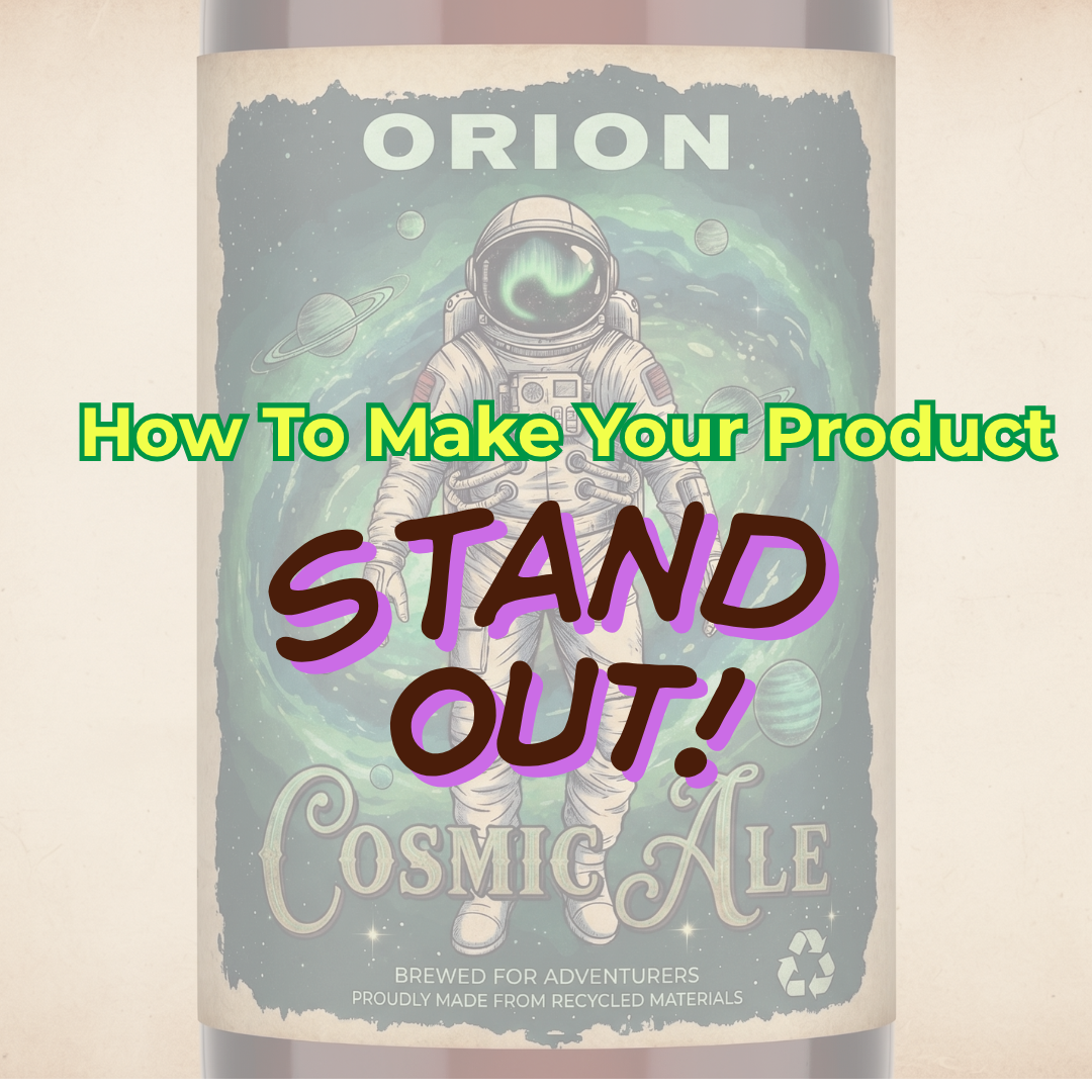
How to Make Your Product Stand Out Using a Label

When you walk down the aisle of a supermarket or retail store, hundreds of products are competing for your attention at the same time. What makes you reach for one over the other?

Before a customer ever tastes your artisan jam, applies your luxury face cream, or uses your retail product, they interact with your packaging. Your label is your silent salesperson. In today’s highly competitive retail landscape, a standard, sticky label often doesn't cut it anymore.

At Soabar Ltd, we have over a hundred years of experience printing labels across a wide variety of sectors. We know exactly what it takes for a consumer to take a product from the shelf and put it into their shopping basket. Here’s your comprehensive guide on how to make your product stand out using a label, from the experts who know their stuff.

How to make your
Coesmetic- Industry Menu Heading

1. Command Attention with the Right Colours

Colour is the most immediate way to communicate your brand's identity and evoke an emotional response. When designing for the retail shelf, you generally have two main strategies: harmonise with your category or deliberately disrupt it.

  • Food and Beverage: Natural, organic, or health-focused foods often utilise earthy greens, soft browns, and matte whites to communicate purity and sustainability. Conversely, if you are launching a bold new hot sauce, a craft beer, or a vibrant snack, high-contrast, neon, or bright primary colours will instantly grab the eye.
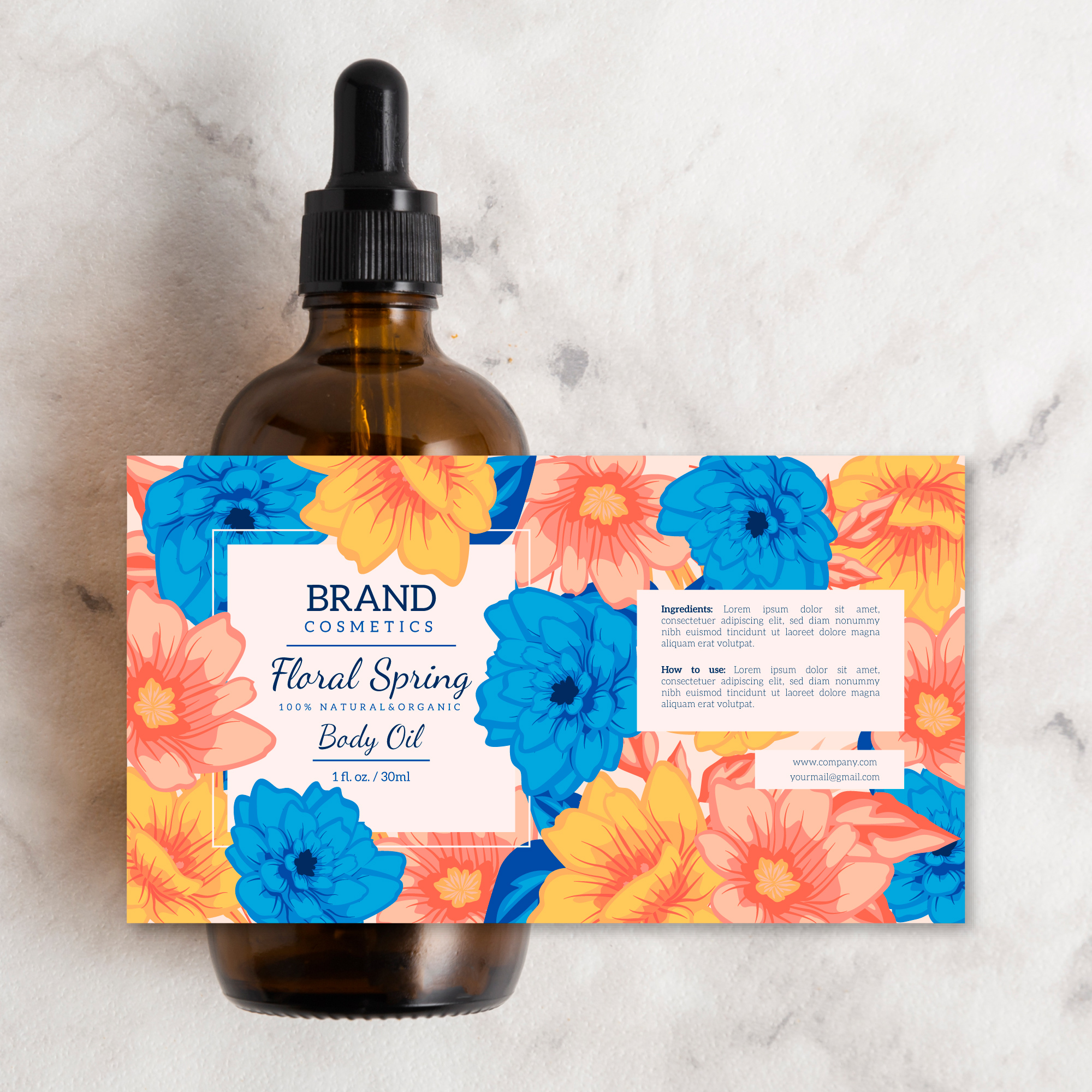
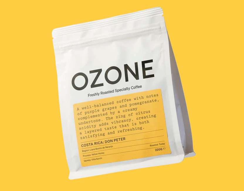
  • Cosmetics and Skincare: Minimalist palettes—think stark black and white, or soft pastels with subtle metallic accents—often communicate luxury, clinical efficacy, and cleanliness.
  • The Product Itself: Remember to consider the colour of the product if your packaging is transparent (like a glass jar or clear bottle). Your label's colours should complement, not clash with, the contents inside.

2. Ideal Size and Custom Shapes

What is the "ideal" size for a label? The answer depends entirely on your container and your brand strategy. A common mistake is assuming the label needs to cover the maximum surface area possible to stand out. We almost always find the opposite to be true.

  • Less is More: For premium liquids, artisan honeys, or luxury serums, using a smaller, minimalist label allows the quality and colour of the product to shine through the glass or clear plastic.
  • Full Wrap-Around: On the other hand, a full wrap-around label gives you maximum real estate for storytelling, vibrant graphics, and necessary regulatory information.
  • Custom Die-Cuts: Don't feel restricted to standard squares, rectangles, or circles. Custom die-cut labels—labels cut into unique, bespoke shapes—are a fantastic way to stand out. A label shaped like a crest, an asymmetrical wave, or a geometric pattern instantly disrupts the visual monotony of standard packaging on a retail shelf.

3. Why Texture Matters

As humans, we’re highly tactile creatures. Once your label's colour and shape have caught a customer's eye, the next step is getting them to pick the product up. If your label feels interesting, they are more likely to hold onto it longer, which increases the chance of them putting it into their basket and purchasing your product.

1. Textured Papers

For craft beverages, artisan foods, or organic cosmetics, textured or uncoated papers provide a rustic, authentic, and premium feel.

2. Embossing and Debossing

We can utilise techniques like embossing (raising parts of the design, such as your logo) or debossing (pressing the design into the material). Imagine a customer picking up a jar of luxury face cream and feeling the raised lettering of your brand name. It instantly communicates high quality before the jar is even opened.

3. Soft Touch Laminate

A highly popular option for high-end retail and cosmetics is a 'soft-touch' laminate. This gives the label a velvety, suede-like feel that equates to luxury and sophistication.

4. Finishes That Catch the Light (and the Eye)

The final protective coating on your label does much more than just prevent scuffing and moisture damage; it’s a crucial design element. Choosing the right finish can completely transform your product's shelf presence.

  • Gloss Varnish or Laminate: This finish is perfect for making colours pop. It provides a highly reflective, shiny surface that is great for vibrant foods, sweets, or household retail items.
  • Matte Finish: This offers a smooth, non-reflective surface that communicates elegance. It’s incredibly popular in the cosmetics, supplement, and premium food sectors because it makes text very easy to read whilst still looking highly sophisticated.
  • Metallic Foiling: Perfect if you want to add a touch of glamour. Hot or cold foil stamping in gold, silver, rose gold, or copper can highlight specific elements of your design, catching the store lighting as the customer walks past.
  • Spot UV: This technique involves applying a high-gloss varnish to specific, targeted areas of a matte label (like your logo or a specific background pattern). The contrast between the flat matte and the raised, shiny gloss creates an eye-catching, premium effect that demands attention.
Food and Beverage- Industry Menu Heading
2

5. Creative Design Ideas to Spark Inspiration

To truly stand out, consider adding interactive or multi-layered elements to your label design:

  • Peel-and-Reveal (Multi-layer) Labels: These are perfect for cosmetics or food products that require extensive regulatory information, ingredient lists, or multi-language translations, but want to keep the front design clean and minimalist. The customer simply peels back the top layer to read the information underneath.
  • Interactive Elements: Incorporate a beautifully stylized QR code that leads the customer to a video tutorial on how to use the cosmetic product, a recipe using your food item, or the story of how the product was made or the brand was founded.
  • The Power of Empty Space: In a sea of loud, busy packaging, a label with vast amounts of negative (empty) space and beautiful, crisp typography can be the loudest voice in the room. Don't be afraid of simplicity and pairing back your design.

Bringing Your Vision to Life

Designing the perfect label is a blend of art and science. It requires balancing aesthetic appeal with practical considerations like material durability, adhesion, and application environments. Whether you are selling a luxury skincare serum, a craft hot sauce, or a household retail product, the right combination of colour, shape, texture, and finish will make your product stand out on the shelves.

Alternatively, our dedicated artwork department is here to assist you every step of the way in the designing process. With over 20 years of experience in graphic and label design, our team has seen thousands of labels pass through our presses and knows exactly what it takes to design one that commands attention in the shelves. Whether you have a fully formed concept or are just starting to brainstorm, simply reach out to discuss your vision and ideas. Our experts would be more than happy to assist you in creating a label that commands attention on the shelf.

Ready to make your product stand out? Contact our team today to discuss your next project and let us help you create a label your customers simply cannot ignore.

about-2 (2)

Frequently Asked Questions - Printer Maintenance

01

What do the lines mean that are going through the print on my label?

If the line is in a diagonal direction, it is likely that the foil is creasing. Simply adjust the tension bar or clutch.

If the lines are vertical, then the printhead could either be dirty, or there could be dots or pixels on the printhead. If the latter is the case, you might need a new printhead. Contact us for us to diagnose the problem before ordering new parts.

Horizontal lines often indicate that the machine has stopped to make a cut. Usually, the machine will automatically try and blend this line out. Trying to alter the design of your label could help to solve the problem, however if there is a cut in the roller then it might need replacing. Contact our Technical Team if you think that this might be the case.

02

Nothing is printing onto my label but it’s going through the print process. What’s happening?

It’s likely that the ink foil is on the wrong way round, and it’s applying ink to the printhead instead of the label. Remove the ink foil, clean the printhead with some of our printhead wipes or isopropyl spray, and put the ink foil back on the other way around. The general rule of thumb when loading ink foil is dull side down, shiny side up!

03

I’ve got a warning notification on my printer. What should I do?

You will likely be seeing something along the lines of ‘No Gap Found / Media Error’, which could mean several things. The labels might be threaded up incorrectly, which will mean that they’re not going through the sensor. Take the roll of labels off and thread them up again, being sure to consult the diagram to make sure you’re doing this in the correct way for your machine. The sensor might not be in the correct position, so try adjusting it slightly to see whether it picks up on the labels coming through. Alternatively, the sensor might need re-calibrating. Either find the button on your machine that will do this for you or contact us for a little more assistance.

04

How do I clean the printhead on my label printer?

Take off the ink foil and get some of our printhead cleaning wipes, or some isopropyl spray and a cloth. Wipe the print area, removing any visible dirt or residue. Rethread the machine, reload the ink foil, and run a small job again to see whether print quality improves.

05

My printer isn’t communicating with my computer. What should I do?

The first thing to do is to check that the cable running between your computer and printer is connected properly, and in the correct port. Also ensure that the port on the computer is selected correctly (e.g. USB-C, USB), by navigating to your settings. You should also make sure that you’re trying to send a job to the correct printer, and not another that is synced with your computer.

Stay Informed with Soabar

Proof Scope
ProofScope – How To Use

We’re excited to share that we're now using ProofScope, an online platform designed to make artwork proofing faster, clearer, and...
Untitled (120 x 50 mm) (120 x 65 mm)
Job Posting: Overprinting Operator

Job Title: Overprinting Operator Location: Soabar Ltd Job Type: Preferably Full-time, Permanent, However Flexible Working & Part-time (4 days a...